← Cinematique Composition · Intermediate

Balancing Elements Prompt for AI Image & Video

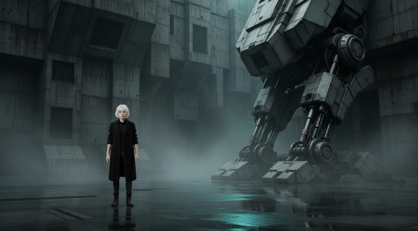
Balancing Elements cinematic example

Distributing visual weight across the frame so no single area feels too heavy or empty — a large subject on one side can be balanced by a smaller but visually striking element on the other. Akira Kurosawa was a master of compositional balance, carefully arranging actors and set pieces to create harmonious frames in "Ran" and "Kagemusha." Emmanuel Lubezki balances Malick's human subjects against natural elements — a face balanced by a cloud formation, a body balanced by a tree. The principle derives from classical painting composition and is instinctive for experienced cinematographers like Roger Deakins, who balances frames intuitively in every setup.

By Ivan Flugelman · Reviewed 16 July 2026

Prompt template

Balanced composition with [Subject] on one third of the frame counterweighted by a visually striking element on the opposite side, the balance not symmetrical but felt, the eye moving comfortably between the two anchoring elements, shot on medium format with a 65mm lens at f/5.6, the compositional harmony of a frame where every element has been weighed and placed with the precision of a balance scale

Replace [Subject] with your own character or scene. The prompt is technology-agnostic and works as a starting point for AI image or video generators.

When to use Balancing Elements

Balancing elements is useful when an asymmetrical frame feels lopsided even though the subject sits in the right place. A large muted figure can be counterweighted by a smaller bright object, strong line, or concentrated patch of contrast. Use the method in dialogue, landscape, still life, and environmental portraits. Balance does not require equal size or symmetry; it requires the eye to feel that visual pressure is distributed with intent.

Directing the AI

Place the primary subject on one side, then choose a secondary element on the opposite side with enough contrast, color, isolation, or shape to counter it. Keep the secondary element clearly less important while giving it sufficient visual mass. Test the spaces between both anchors and the frame edges. In video, preserve the balance as figures move by shifting camera position, blocking, or background emphasis rather than adding arbitrary objects.

Common mistakes

  1. Matching both sides by size alone, ignoring how brightness, color, texture, and isolation change perceived visual mass.
  2. Making the counterweight as prominent as the subject, splitting attention between two equally demanding focal points.
  3. Correcting imbalance with an unrelated prop that has no place in the environment or connection to the scene.
Sources and further reading

  1. Rules of Shot Composition in Film — StudioBinder
  2. Composition Techniques in Film — StudioBinder

A shot is not a world

Learn the fourteen fundamentals for building consistent characters, environments, visual logic, and stories that expand beyond one beautiful frame. Get World Building Codex 3.0 free, or explore the World Building Academy.

Related techniques

Visual Weight

The perceived heaviness of elements in a composition based on size, color, contrast, texture, and isolation — understanding visual weight is key to creating balanced or deliberately unbalanced frames. Akira Kurosawa demonstrated extraordinary sensitivity to visual weight in "Ran," balancing armies against landscapes with painterly precision. Wes Anderson manipulates visual weight through color — a single bright element against a muted background carries enormous visual mass. Roger Deakins understands that a small bright area in deep shadow can outweigh a large dark area, using this principle to control attention throughout the Coen Brothers' filmography.

Rule of Thirds

Dividing the frame into a 3x3 grid and placing key elements along the lines or at their intersections, creating naturally balanced, dynamic compositions that feel more alive than dead-center framing. While most directors use the rule instinctively, Roger Deakins and the Coen Brothers apply it with mathematical precision in films like "Fargo" and "No Country for Old Men." Emmanuel Lubezki frequently places subjects at the right-third intersection in Terrence Malick's films, leaving vast spaces of sky or landscape to fill the remaining two-thirds. The rule derives from classical painting composition and remains the most fundamental principle taught in both cinematography and photography.

Contrast

Using opposing visual elements — light vs dark, large vs small, warm vs cool, sharp vs soft — to create visual interest, hierarchy, and dramatic tension within the frame. Akira Kurosawa was perhaps cinema's greatest practitioner of compositional contrast, pitting tiny samurai against massive rainstorms in "Seven Samurai" and fragile humans against erupting volcanoes of color in "Ran." David Lean used scale contrast — small figures against enormous landscapes — as his signature in "Lawrence of Arabia" and "Doctor Zhivago." Christopher Nolan employs contrast between warm intimate interiors and cold vast exteriors throughout "Interstellar" to visualize the tension between human connection and cosmic indifference.