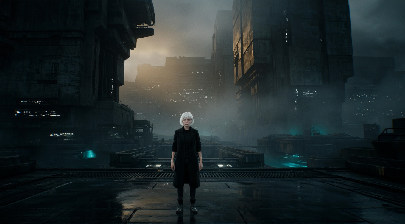
Using opposing visual elements — light vs dark, large vs small, warm vs cool, sharp vs soft — to create visual interest, hierarchy, and dramatic tension within the frame. Akira Kurosawa was perhaps cinema's greatest practitioner of compositional contrast, pitting tiny samurai against massive rainstorms in "Seven Samurai" and fragile humans against erupting volcanoes of color in "Ran." David Lean used scale contrast — small figures against enormous landscapes — as his signature in "Lawrence of Arabia" and "Doctor Zhivago." Christopher Nolan employs contrast between warm intimate interiors and cold vast exteriors throughout "Interstellar" to visualize the tension between human connection and cosmic indifference.
By Ivan Flugelman · Reviewed 16 July 2026
Prompt template
High contrast composition with [Subject] as a tiny warm-colored element against a vast cool-toned environment, every type of visual contrast at work simultaneously — warm against cool, small organic shape against massive geometry, soft texture against hard surface, movement against stillness, shot on large format 65mm with a 100mm telephoto compressing the background, Kodak Vision3 50D saturated daylight stock
Replace [Subject] with your own character or scene. The prompt is technology-agnostic and works as a starting point for AI image or video generators.
When to use Contrast
Contrast is useful when a frame needs immediate hierarchy or when two forces should feel emotionally opposed. Pair warm with cool, small with large, soft with hard, organic with geometric, or motion with stillness. It can clarify the subject or turn the entire composition into conflict. Choose one primary opposition and support it with others carefully. If every property fights at once, the image becomes noisy instead of forceful.
Directing the AI
Select the dominant contrast first, such as a small warm figure against a vast cool structure. Reinforce it through scale, texture, and stillness only where those differences support the same idea. Keep the subject readable and prevent secondary colors or objects from creating rival conflicts. Describe both sides of the opposition concretely. For video, let the contrast persist through movement and cutting, or reveal one side after the other so the collision lands with intention.
Common mistakes
Stacking unrelated oppositions across color, scale, texture, and motion until the frame loses one dominant visual argument.
Using strong tonal contrast without controlling the brightest area, allowing a background highlight to steal the subject's hierarchy.
Choosing opposing colors as decoration while size, lighting, and staging communicate no actual tension between the elements.