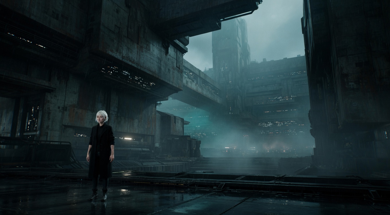
The perceived heaviness of elements in a composition based on size, color, contrast, texture, and isolation — understanding visual weight is key to creating balanced or deliberately unbalanced frames. Akira Kurosawa demonstrated extraordinary sensitivity to visual weight in "Ran," balancing armies against landscapes with painterly precision. Wes Anderson manipulates visual weight through color — a single bright element against a muted background carries enormous visual mass. Roger Deakins understands that a small bright area in deep shadow can outweigh a large dark area, using this principle to control attention throughout the Coen Brothers' filmography.
By Ivan Flugelman · Reviewed 16 July 2026
Prompt template
Visual weight study with [Subject] as a small but vivid element carrying visual mass disproportionate to its physical size through isolation, color saturation, and tonal contrast, the composition deliberately exploring how chromatic density creates perceived heaviness independent of actual size, shot on a 35mm lens at f/5.6 with clinical sharpness throughout
Replace [Subject] with your own character or scene. The prompt is technology-agnostic and works as a starting point for AI image or video generators.
When to use Visual Weight
Think in visual weight when a composition feels wrong despite correct spacing or grid placement. Brightness, saturated color, sharp detail, isolation, and faces can make a small element outweigh a much larger quiet form. The principle helps balance asymmetrical frames or create deliberate unease. Use it during environmental portraits, ensemble staging, and graphic compositions. Judge what the eye notices first and how long it stays there, not only how much physical area each element occupies.
Directing the AI
Identify the primary visual mass, then control its size, brightness, color saturation, texture, and isolation. Counter it with another element whose combined qualities create the desired balance, even if its physical size differs. Keep low-priority areas quieter through reduced contrast and detail. Test the eye path from first glance to secondary anchor. For video, account for moving weight: a small bright figure crossing a dark field can dominate the frame more than static architecture.
Common mistakes
Balancing objects by physical size alone while ignoring the disproportionate pull of faces, bright highlights, and saturated color.
Giving every area equal contrast and texture, leaving the frame without a clear hierarchy of perceived importance.
Adding a vivid counterweight near the edge, accidentally pulling the viewer out of the frame instead of across it.