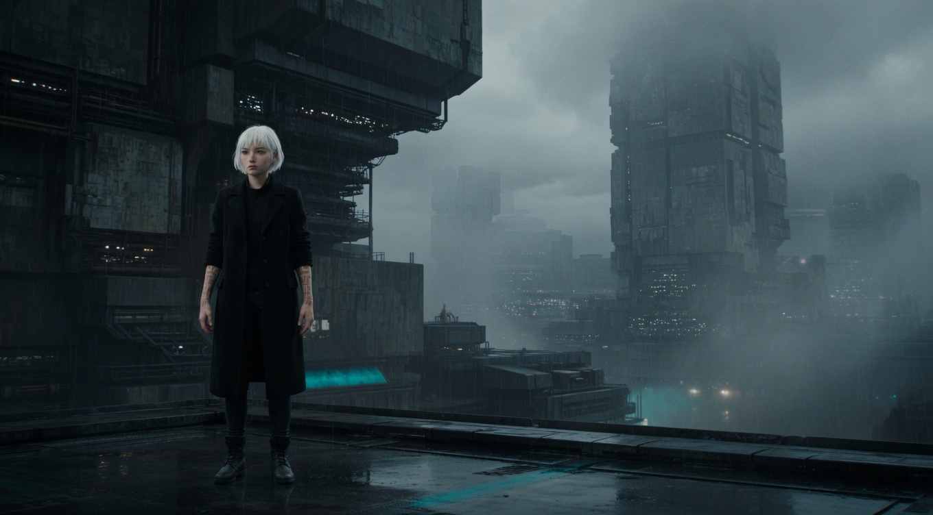
Dividing the frame into a 3x3 grid and placing key elements along the lines or at their intersections, creating naturally balanced, dynamic compositions that feel more alive than dead-center framing. While most directors use the rule instinctively, Roger Deakins and the Coen Brothers apply it with mathematical precision in films like "Fargo" and "No Country for Old Men." Emmanuel Lubezki frequently places subjects at the right-third intersection in Terrence Malick's films, leaving vast spaces of sky or landscape to fill the remaining two-thirds. The rule derives from classical painting composition and remains the most fundamental principle taught in both cinematography and photography.
By Ivan Flugelman · Reviewed 16 July 2026
Prompt template
Rule of thirds composition with [Subject] positioned at the upper-right power point intersection, eyes precisely on the top horizontal third line, the remaining two-thirds of the frame filled with negative space creating natural visual flow, the composition dynamically balanced despite being asymmetrical, shot on a 50mm lens at T2.8, overcast daylight providing even naturalistic illumination
Replace [Subject] with your own character or scene. The prompt is technology-agnostic and works as a starting point for AI image or video generators.
When to use Rule of Thirds
Use the rule of thirds when a centered frame feels static but the composition still needs immediate clarity. It suits portraits, landscapes, interviews, and moving subjects because it creates space for gaze, direction, or environment. Place the focal point at an intersection and use the remaining area intentionally. The grid is a starting structure, not a decoration; break it when confrontation, symmetry, or deliberate discomfort would serve the scene better.
Directing the AI
Divide the frame mentally into a three-by-three grid. Place the subject's primary focal point, often the eyes or face, on one power-point intersection and align the horizon or dominant architecture with a third line. Give the open two-thirds a purpose through landscape, gaze direction, or approaching action. Keep secondary elements from competing with the focal point. For video, preserve useful lead room as the subject moves rather than forcing them mechanically onto one grid point in every frame.
Common mistakes
Placing the subject near a third line while leaving the remaining space empty of meaning or directional purpose.
Aligning every object to the grid, creating a visibly calculated frame instead of a naturally balanced composition.
Using the rule during direct confrontation or formal symmetry, where off-center placement weakens the intended psychological force.