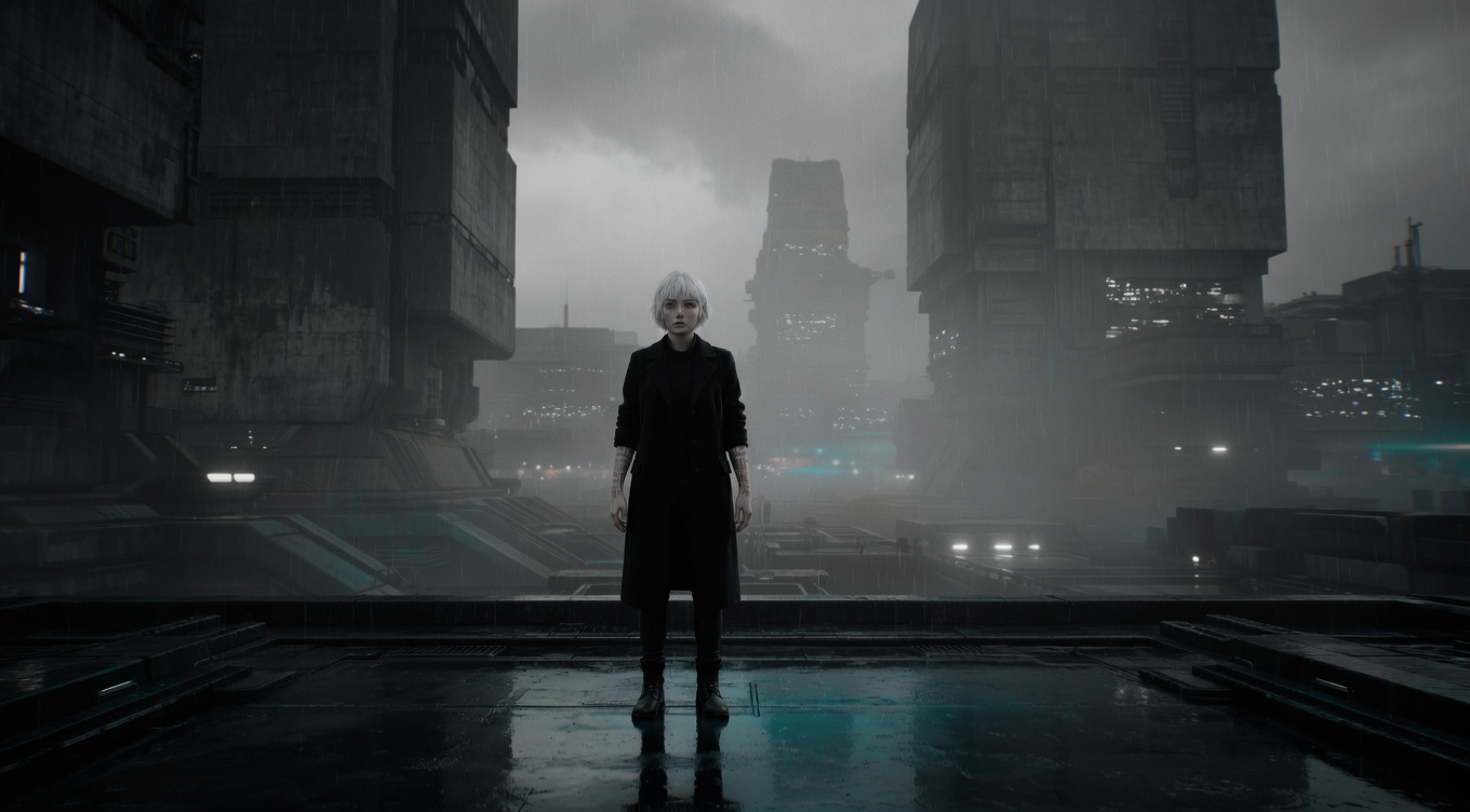
Reducing color intensity in the image, moving toward grayscale to create a bleak, documentary, or dreamlike quality — partial desaturation can isolate a single color for dramatic effect. Steven Spielberg used near-total desaturation in "Schindler's List" with the famous exception of the girl's red coat, creating one of cinema's most iconic selective-color moments. Ridley Scott desaturated "Black Hawk Down" for combat realism. "Sin City" by Robert Rodriguez uses radical desaturation with selective color to recreate Frank Miller's graphic novels. Janusz Kamiński's desaturated look for "Saving Private Ryan" established the visual template for modern war films.
By Ivan Flugelman · Reviewed 16 July 2026
Prompt template
Desaturated scene with [Subject] approaching monochrome, all color drained to near-gray except for a single vivid element, the Spielberg "Schindler's List" technique of selective color isolation, the surrounding gray rendering the world as bleak while the single color insists that something vital remains, heavy desaturation in grading leaving only one color channel active
Replace [Subject] with your own character or scene. The prompt is technology-agnostic and works as a starting point for AI image or video generators.
When to use Desaturation
Use desaturation for bleak realism, memory, documentary severity, graphic stylization, or a world emotionally drained of vitality. Partial desaturation can guide attention toward one remaining color, but that color needs narrative significance. The approach works when luminance, texture, and shape remain strong after hue is reduced. It fails when gray treatment is expected to create drama that the composition and lighting never supplied.
Directing the AI
Reduce saturation across the scene while preserving distinct values in skin, clothing, architecture, and background. Let most hues approach neutral gray rather than collapse into one muddy tone. If isolating a color, choose a single object and retain its vivid channel with clean edges and believable reflections. Support the treatment with directional light and strong tonal contrast. Keep the selected color stable across frames so it reads as intention, not processing noise.
Common mistakes
Removing color without preserving value contrast, producing a flat gray image with no visual hierarchy.
Leaving several unrelated colors vivid, weakening the narrative force of selective color isolation.
Oversaturating the retained hue until it appears pasted on rather than present in the photographed world.